
overview
The Metropolitan Police Angling Society (MPAS) connects officers and staff through the calming practice of fishing. Their “Peace of Mind – One Cast at a Time” campaign promotes wellbeing and social connection among the 999 community. To extend its reach, the society sought a refreshed brand identity and a modern, accessible digital presence.
design goal

To create a cohesive visual identity and digital experience that reflect the calm, restorative nature of fishing, while promoting participation and community engagement across the 999 network.
But…
The challenge was to modernise the society’s identity while keeping it approachable and human — not corporate.
understanding users
I conducted informal interviews with 15 officers who were angling at the Metropolitan Police’s private lake site to understand how fishing supports their mental health and daily wellbeing.
To better understand these different motivations and needs, I synthesised the findings into five representative personas.
pain point
Information was difficult to access.
The society felt difficult to approach.
The wellbeing message was overshadowed.
The campaign lacked a cohesive digital presence.
defining identities
Research highlighted the need for a calmer, more approachable experience, shaping a visual identity inspired by the restorative nature of angling.
To give Peace of Mind its own identity while maintaining its connection to MPAS, I redesigned the MPAS emblem with a monochrome option and created a typography-led campaign logo. Soft colours, generous whitespace and approachable typography brought both identities together across digital and print materials.


shaping experience
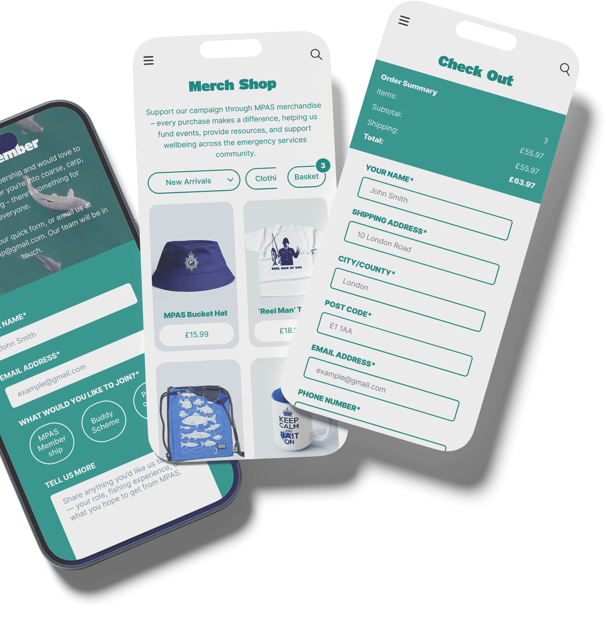
With the visual identity established, the next step was to translated the brand system into a responsive website experience. Through wireframing and iterative exploration, I organised content, refined navigation, and prioritised key user journeys to make information easier to find and access.


Rather than creating separate journeys, key participation pathways were combined into one streamlined form. This allows users to express their interests and register with just a few clicks.
Upcoming events were brought into a clear calendar view, allowing users to scan dates, access event details, and move directly into registration.


Designed across desktop, tablet, and mobile breakpoints, the experience adapts to each screen while keeping key journeys consistent across devices.


outcome & reflection
Within 9 months of introducing the refreshed identity and Peace of Mind campaign, MPAS saw stronger engagement across membership, activities and wellbeing initiatives. The new direction helped support a more active and connected community.
Despite the wider visual system achieving strong engagement, the website itself has not yet launched fully as designed. Front-end development constraints limited the final implementation, leaving the digital experience as the main unfinished part of the project.
If I take the project further, my next step would be to take greater ownership of implementation — working more closely with development, or exploring whether I can bring the designed experience through to launch myself.