

overview
Döner & Gyros is a UK high-street food chain specialising in döner, gyros and quick-service meals. As part of a wider brand refresh, the company proposed a dedicated mobile app alongside updated promotional materials to strengthen its digital presence and encourage direct customer engagement. However, with customers already ordering through delivery platforms, the challenge wasn't designing another app—it was defining why customers would choose to use it.
Rather than assuming a dedicated app would benefit customers, I began by exploring existing research into restaurant apps and customer behaviour. This helped establish what motivates people to download an app—and just as importantly, what discourages them from keeping it.
Existing research identified why people download restaurant apps—but did those motivations reflect Döner & Gyros' customers? To better understand the targeting audience, I reviewed Google Reviews to uncover what people valued most about the brand.
Although customers loved the in-store experience, very few comments mentioned the ordering experience itself. Customers already enjoyed the restaurant experience. The opportunity wasn't to replace it—it was to make returning easier.

Having identified what mattered most to Döner & Gyros customers, I benchmarked leading restaurant apps to understand how successful products addressed these needs in practice. This helped validate my findings and identify interaction patterns worth adapting for the D&G experience.


insight to strategy
I translated the research into a product strategy centred on reducing friction and increasing opportunities for repeat visits. Personas and user journeys helped prioritise the features and navigation that mattered most.
Based on the customer journey, I organised the app into a streamlined navigation that surfaces the most valuable features while reducing unnecessary steps.
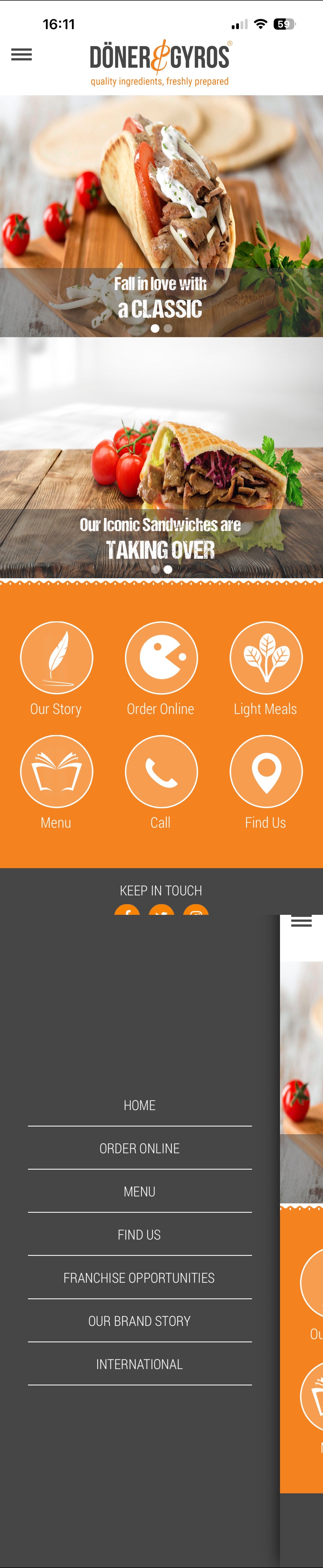
With the core navigation established, I translated the information architecture into a cohesive mobile experience. Each screen was designed around the three priorities—making the menu easy to browse, rewards highly visible and promotions easy to discover.

" height="25.297301764223505px" id="r7Vd6VekX" transform="translate(6 8)" width="26.70606009453209px"/></svg>)
" height="25px" id="HnPZsPx7r" transform="translate(8 8)" width="24.190642153834716px"/></svg>)
" height="26.646271299962187px" id="r5W1qQ5WM" transform="translate(11 6.5)" width="17.54678556521634px"/></svg>)
" height="26.78593034745887px" id="vpGzwNBvS" transform="translate(13 6.5)" width="14.836298215433203px"/></svg>)
" height="23.809598568737048px" id="yd1hMXTUA" transform="translate(11 8)" width="17.06181663440876px"/></svg>)
" height="21.915533472390734px" id="V4hMRA2TL" transform="translate(7 9.5)" width="26.705759942316483px"/></svg>)
" height="22.321362790295183px" id="vZ3CFzJXB" transform="translate(8 9.5)" width="23.738167670644373px"/></svg>)
" height="22.321443859423287px" id="vSiR3Ypii" transform="translate(11 9)" width="18.546051713928875px"/></svg>)
" height="24.55367784101403px" id="dmJO5cTvP" transform="translate(11.5 7.5)" width="17.06163319811594px"/></svg>)
" height="18.728024378894304px" id="m50vMgHgy" transform="translate(9 11)" width="23.72938596053433px"/></svg>)




beyond the app
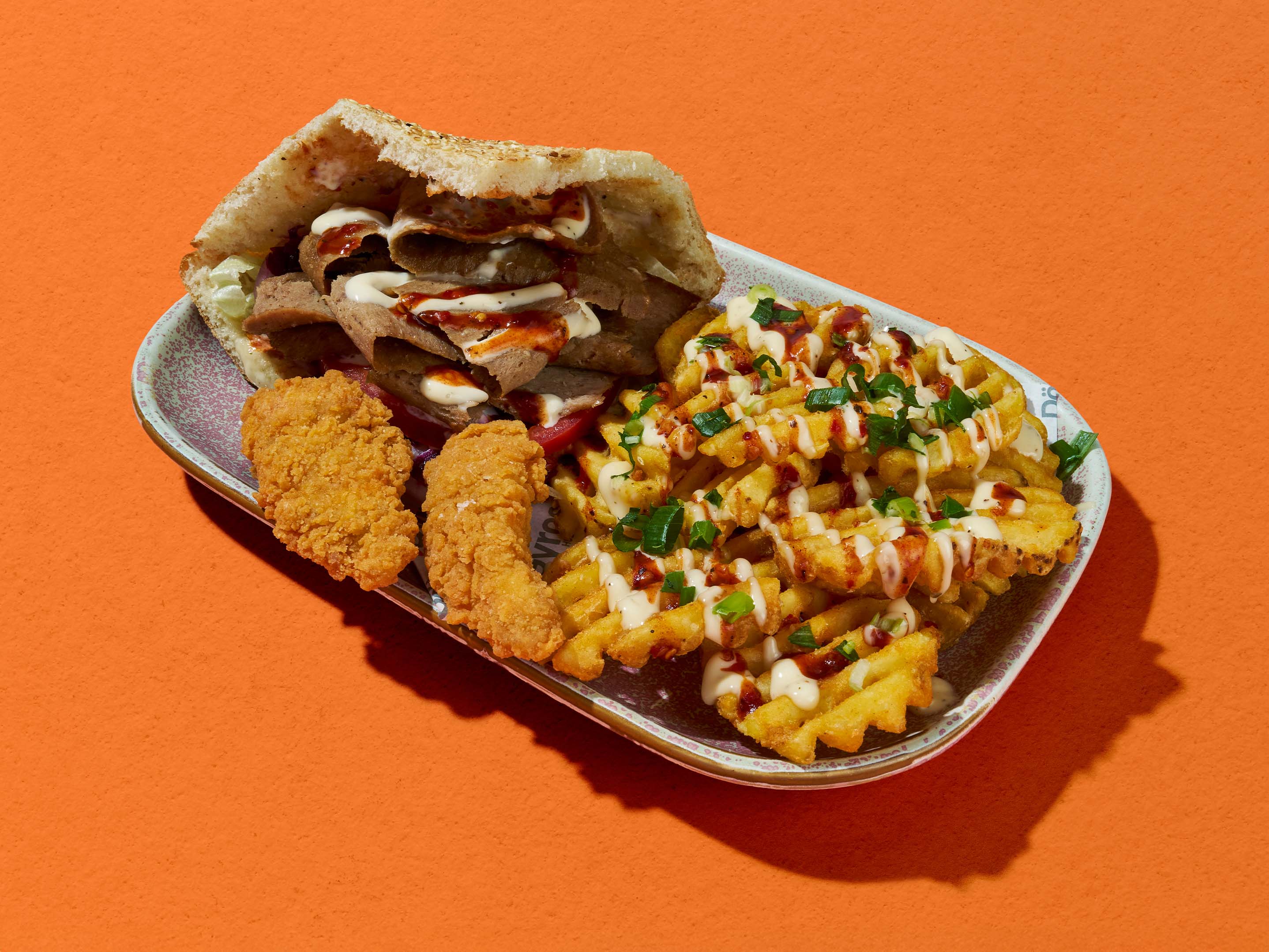
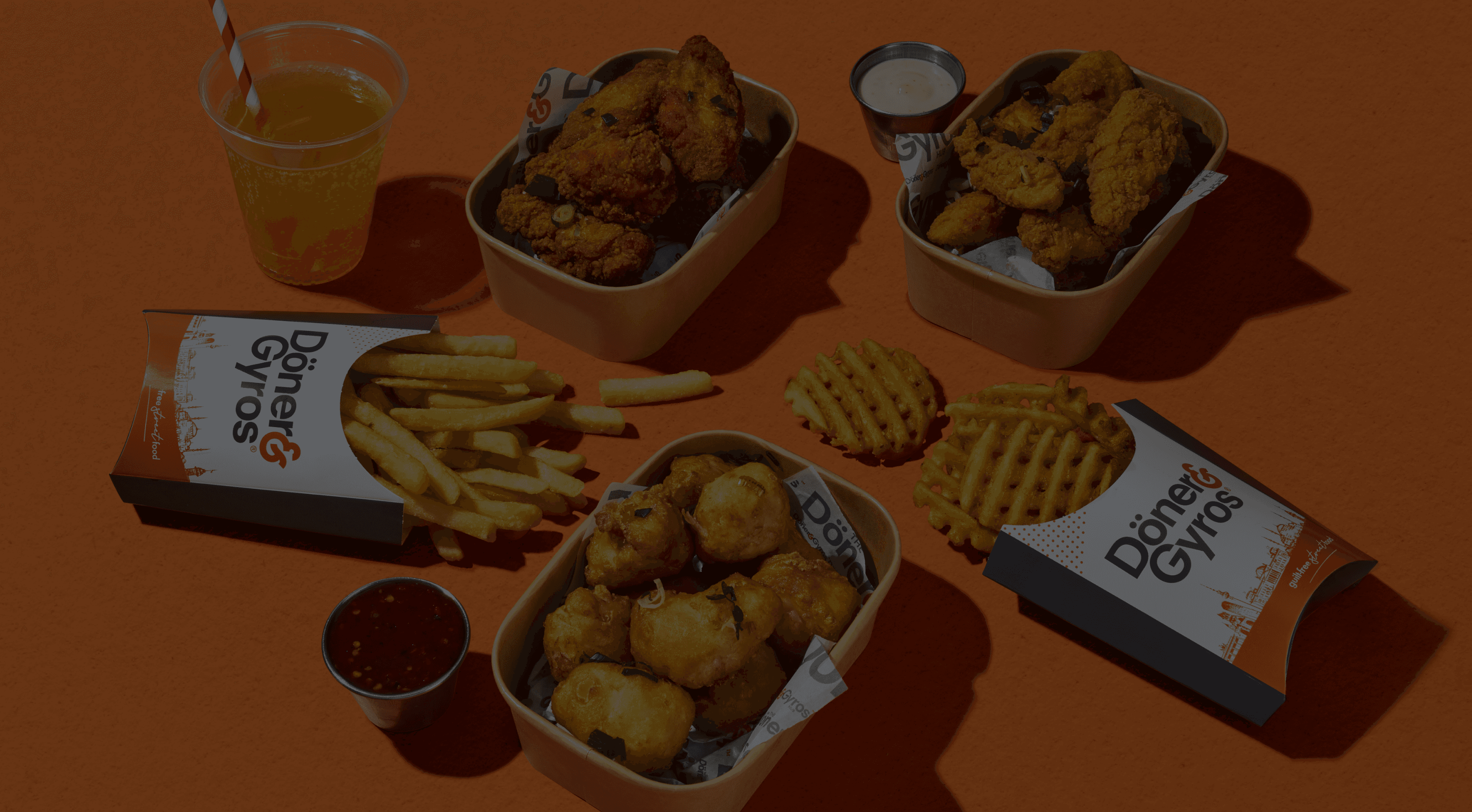
The app formed the centre of the refreshed customer experience, but the project extended beyond mobile. To create a consistent journey across physical and digital touchpoints, I applied the visual language to a range of in-store and promotional materials.




takeaways
Although the concept has not yet progressed to development, it provides a strategic foundation for future digital initiatives. By grounding every design decision in customer research, the project demonstrates how product thinking, UX design and brand communication can work together to create a connected customer experience.